de en


E-Mail: Inhalt erstellen mit Template

{alt}

This help page describes the Newsletter Editor in versions 1 and 2.

Here you switch to the editor V4 help or check your currently used editor version.


If you have selected an email template when creating your mailing, you can easily compose the structure and content of your email on the 'Content' tab. Besides the HTML part, the text part of your mail will be created automatically.

If you have not selected a template (see 'Inhalt erstellen ohne Template'), the tabs 'HTML' and 'Text' will appear instead, or depending on the selected format (default setting: multipart format) only one of the two tabs. Here you can create the HTML code and text part of your mailing manually.

If you are new to Shared Services - Graubünden Ferien, please skip the following section. It is intended only for users who have been working with Shared Services - Graubünden Ferien for a long time.


Newsletter-Editor V1 or V2?

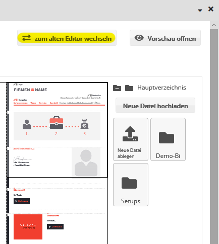
When creating your mailing, you have the choice between version 1 and version 2 of the integrated newsletter editor. If this selection option is enabled in your ###system_name## account, then you will find the 'switch to new editor' button above your mailing on the right.

As a rule, the new editor is the better choice, because it has two decisive advantages:

  • Faster work: By clicking on the new 'Apply' button, changes made are immediately visible in the draft. The previously necessary intermediate step of first saving each change on the server is no longer necessary. This is taken care of by Shared Services - Graubünden Ferien in the background: Several times a minute, as well as when you exit the design view, your changes are automatically saved to the server. If you prefer manual saving instead, change the corresponding setting in the 'custom settings' --> 'system settings' --> 'auto-save' menu.
  • Direct access to images: From the new media sidebar, drag'n'drop images directly into the element of your mailing currently open for editing. In addition, new image files can be uploaded in the media sidebar without leaving the design view.

The only exception: If one of your mailing templates was equipped with the special functions 'Fill content via RSS feed' or 'Article import from OXID eShop', the new editor is currently not yet available for their editing. In this case Shared Services - Graubünden Ferien will automatically open the previous editor without the possibility to switch to the new editor.

Switching between previous and new editor

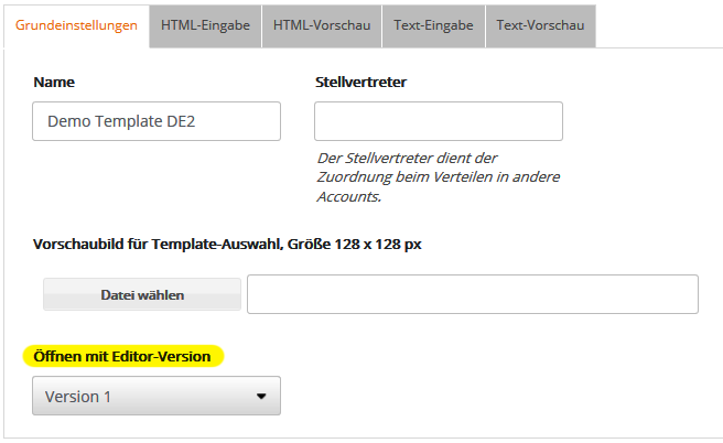
In the menu 'Modules' --> 'Templates' --> 'Email' you can define for the selected template whether the old (version 1) or the new editor (version 2) should be displayed first in the basic setting. The corresponding option can be found in the dropdown box 'Open with editor version':

Editor wechseln

If version 2 is selected, all designs based on this template are opened with the new editor, including all existing designs that use this template. The last selected editor version applies in each case.

Regardless of this, you can also switch between the old and new editor directly in the design view at any time:

zum alten Editor wechseln

'Content' tab: The new editor

The screen layout

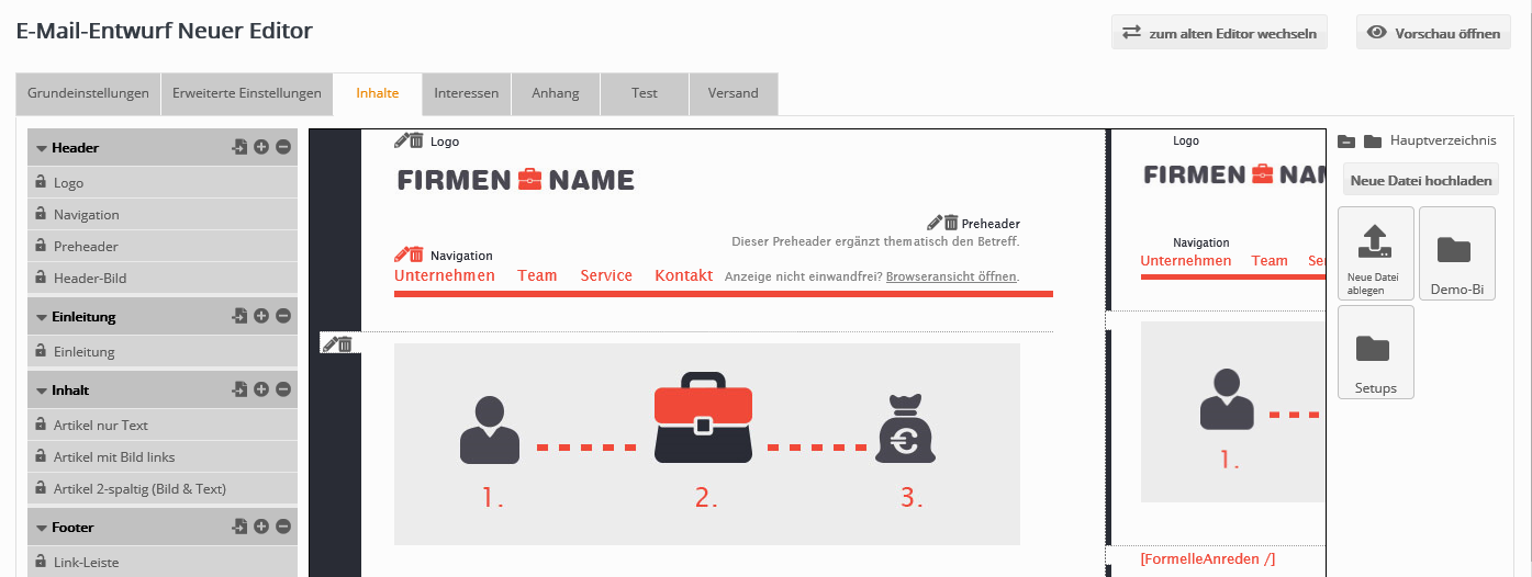
The design view consists of four areas, from left to right:

  • Element tree: shows the structure of your mailing, here you insert the desired elements provided by your template
  • Draft: shows your draft in original size
  • Mini view: shows a reduced overview for quick navigation
  • Media sidebar: shows all images of your Medienverwaltung and allows to insert new images by drag & drop.


Inhalte

The four screen areas in detail:

--> The Element tree

In the element tree (far left) you define the structure of your email, depending on the selected design template.

A design template consists of containers (dark background color in the element tree). These are fixed in the template (e.g. preheader, logo, content, footer) and cannot be changed in their order.

Within a container, elements (light background color in the element tree) can be inserted in any order. For example, the "Content" container can be filled with different items. Which elements are available in which container is also defined in the design template.


Elementebaum  

The icons in the header of each container provide the following functions when hovering the mouse cursor over them:

  • Plus: Inserts a new element in the current container. Which elements are available for selection depends on the template used. You can add as many elements as you like, but you should not overload your newsletter.
  • Minus: Removes all elements of the current container (after confirmation prompt).

If the 'Contents' module is enabled in your account, another icon appears in front of the plus/minus symbol. This allows you to insert a ready-made content that you would like to use identically in several mailings or landing pages, e.g. your imprint. After selecting the desired content type, you select a text module, which is then transferred directly to the created content. You can create such a content module in the menu 'Modules' --> 'Contents'.

For each element you will find five icons for editing, moving, locking, copying and deleting this element.

--> Note: By default, after inserting a new element, the overall view of the email draft is displayed again. Alternatively, it is possible to switch to the edit view of the new element immediately after adding it. The default behavior can be selected in the menu at the top of the screen: 'own settings' --> 'system settings' --> 'behavior after creating new elements'. Here you can choose between the variants 'Insert element' and 'Edit element'.

The sample template has the following structure:

  • Preheader: The preheader is technically nothing more than the first line of your mailing. This is displayed in the inbox of many email programs together with the subject as a preview. Therefore, use the preheader as an extension of the subject line. It should arouse additional curiosity. This should be followed by the usual link to the online view or website view of the email. This allows the content of the email to be displayed as a web page in the reader's web browser.
  • Logo and social media: Here you can place your logo, including a link to your company website or a landing page, for example.
  • Content: You can start the main body of your email with an introduction, for example, consisting of a headline, text and an image (position on the right or left can be freely determined). This could be followed by the personal salutation, followed by a content introduction that you use as a teaser for the following articles or that links to your company's news website, for example. This could be followed by several articles that promote individual products, for example, or include visual separators.
  • Footer: Imprint and unsubscribe link form the conclusion of your email.

As soon as you move the mouse cursor over the line of a content element, five icons for editing, moving, locking, copying and deleting this element will appear.

  • Edit element: By clicking on the edit icon (or the name of the element), the detailed view for editing the content will open. Its possibilities for inserting text, images and links will be explained in the next section Editing Content Elements: The Detail View explains.

--> Note on the changed saving behavior in the new editor:
After clicking 'Apply', the changes made will be immediately displayed in the draft view, without the need to save them to the server (as before). This is done automatically by Shared Services - Graubünden Ferien in the background: Several times per minute and when you exit the design view, your changes are saved to the server. If you prefer manual saving instead, change the corresponding setting in the menu 'custom settings' --> 'system settings' --> 'automatic saving'.

  • Move element: To change the order of elements within a container, click this icon and drag'n'drop the element up or down to the desired location.
  • Copy element: Clicking this icon inserts an identical copy of the selected element directly below it.
  • Delete element: Clicking this icon removes the selected element (after confirmation prompt).
  • Lock element: By clicking on this icon you lock the element for modification by other users who lack the right 'Allow editing of locked items'.

--> Tip: The width of the element tree window can be enlarged and reduced by dragging the right edge of the element tree window.


--> The design view

The Draft view displays the draft of your email in its original size. To edit a specific content, either click on the desired element in the element tree (see previous section) or on the corresponding (green) icons directly in the draft view. This will open the edit view of that element. Its possibilities for inserting text, images and links will be explained in the next section Editing content elements: The Edit View.

Entwurfansicht

The window width of the design view can be increased and decreased by dragging the right edge of the window between the mini-view and the media sidebar.

--> Tip: As soon as you go below a certain window width while dragging, the draft is automatically displayed in mobile view.


--> The mini preview

Minivorschau


To the right of the large design view, the 'Mini Preview' shows a reduced overview of your design.

The visible image section can be moved up and down with the mouse or clicked directly.

This means that even in large mailings, the desired position can be reached immediately.


--> The media sidebar

On the right side of the screen, the media sidebar displays all images and folders in your media management. Here you can upload new image files and drag and drop images into 

Mediensidebar


Upload new images:

  • Click the 'Upload new file' button

or

  • Drag and drop one or more image files from your Windows Desktop (or Explorer) or Mac Finder onto the 'Drop New File' image icon.

Drag an image into your mailing:

On the left side of the design, open the desired element for editing.
Then drag'n'drop the desired image from the media sidebar into the open editing view, either onto the input line of the image URL or onto the displayed preview image. This replaces the previously set image.

In the navigation bar above the folders, the name of the current folder is highlighted in bold. Click on a folder to display its contents. Click on 'Main folder' to return to the beginning of the folder navigation at any time. The button 'Ignore folder' hides the folder structure and shows all images stored in the media management together, regardless of which folder they are in.


Edit content: The detail view

After you have clicked on an element for editing in the element tree or in the design view, its detail view opens. Here you add your concrete content, i.e. text, images and links.

In the detail view you will find the tabs 'General' and 'Interests'.

Detail-Ansicht

After clicking on 'Save' (previous editor) or 'Apply' (new editor) the changes made are displayed in the design view.

--> Note on the changed saving behavior in the new editor:
After clicking 'Apply', the changes made are immediately displayed in the design view, without the need to save them on the server (as before). This is done automatically by Shared Services - Graubünden Ferien in the background: Several times per minute and when you exit the design view, your changes are saved to the server. If you prefer manual saving instead, change the corresponding setting in the menu 'custom settings' --> 'system settings' --> 'automatic saving'.

Embed text: Formatting

You can enter texts in the input fields provided. Text breaks are automatically applied. If you want to use different formatting, such as 'bold', 'italic' or 'underlined', simply select the corresponding text passage and click on the corresponding icon.


Text einbinden

Embed text: Font sizes

Click on the 'Change font size' icon (A). The size can be adjusted individually - in whole numbers. The number must always be followed by 'px' (for "pixel").


Example: [SPAN style='font-size:10px']Font size of 10 pixels[/SPAN].


Embed text: Front colors

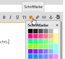
You can select font colors using the small button with the brush icon. Simply select the corresponding text and choose a color.


Schriftfarbe

With the placeholder, the colored area will look like this:

[SPAN style='color:#ff0000']This will be a red text.[/SPAN]

A color table with the corresponding HEX color codes can be found here:
http://www.dauerstress.de/homepagehilfe/farben-generator.php
Please note that the hash must always precede the 6-digit code!


Include links

Links to websites are inserted using the Link icon Link. Select the text you want to link, for example, the word "Google". Then click the icon and enter the destination URL in the address field, for example, "http://www.google.de".

Important: Each website link must begin with http:// or https://, i.e. entering "www.google.de" is not sufficient.

To make the inserted link evaluable for the statistics, either the default setting 'Apply global tracking setting' must be activated or, if you want to force tracking for this link, the option 'Tracking active'.

Optionally, enter a comment as an additional identifier for your link. Different comments allow you to evaluate the clicks separately even if the same link URL is used several times, e.g. whether the recipient clicked on the link to the online store in the article text or in the navigation menu of the mail.

What the 'Apply global tracking setting' option does, you set in the 'Advanced settings' of the mailing in the 'Tracking' section. Here, 'Automatic link tracking in HTML part' should be activated.


Link-Tracking

Email links are not tracked, so there is a separate button for this:E-Mail 

Here applies: mark the text before again and enter the email address in the dialog.


Example: [LINK mailto='test@Graubünden Ferien.de']Email[/LINK]


E-Mail Link

Explanation:

- tracked link: After the mailing has been sent, you can view the click rates of the recipients in the statistics under the menu item 'Success evaluation'.

- Link with comment: The comment is displayed in the statistics instead of the link name. This is clearer for long link paths, for example.

Furthermore, it is possible to store a tracking code from your web analysis tool in the advanced settings and Shared Services - Graubünden Ferien will automatically include it in all external links contained in the mailing.


Style specifications

With HTML and CSS knowledge, further individual adjustments can also be made using style specifications. There are many possibilities when formatting with CSS styles. You can find the corresponding commands on this free page:
http://www.css4you.de


Under the entry aids in the tab 'Formatting' the 'Range' can be found. This can be used to implement CSS specifications. Inserted the placeholder looks like this:

[SPAN id='...' class='...' style='...']Text with capital letters[/SPAN].

Now decide if you want to assign an 'id' or 'class' or if you want to write the style information directly into the style attribute. For example, if you want to set a text in uppercase, then use the specification: 'text-transform: uppercase'.
Example: [SPAN style='text-transform: uppercase;']TEXT WITH CAPITAL LETTERS.[/SPAN]

It is also possible to combine several specifications. Please use the semicolon (;) as separator.


Formatierungen

Include lists

If you want to divide a text into list items, proceed as follows: Mark the entire text to be defined as a list with the mouse and select the command 'Unordered list' or 'Ordered list' in the 'Accessibility', ' Formatting' tab.

Example:

- Unordered list (list with bullet points)
[UL]Rattling is part of the trade Understanding and meaningfully interpreting customers Successfully conducting conversations Meaningful goals and successful strategies Clear organization in the company[/UL].
- ordered list (list with bullet points)
[OL]Rattling is part of the trade Understanding customers and interpreting them meaningfully Leading successful conversations Meaningful goals and successful strategies Clear organization in the company[/OL].


Next, you need to assign the individual list items. To do this, select each list item individually with the mouse and choose List Item from the 'Accessibility', ' Format' tab in the menu.


Example:
[UL][LI]Rattling is part of the trade[/LI]
[LI]Understanding and making sense of customers[/LI]
[LI]Conducting successful conversations[/LI]
[LI]Meaningful goals and successful strategies[/LI]
[LI]Clear organization in the company[/LI][/UL]

Here, [UL] denotes the beginning of the entire list and [/UL] the end. [LI] is the start of a single list item and [/LI] its end.


Insert images


Click on an image element of your template in the design view, then a pop-up window opens for editing the image details. Use the 'entry helpers' to insert the desired image from your Medienverwaltung or upload a new image by clicking on the 'Upload' button. If the template provides a link to the image, enter the link URL of the image.

Important note on image size: Depending on the template, you can specify in the 'Image width' and 'Image height' input fields the size in which the image is to be displayed in the mailing. The size of the image file used in the mailing remains unchanged. Therefore, make sure to reduce especially large image files to the planned display size. The appropriate functions for cropping and reducing the size of the image are available directly in the 'Medienverwaltung'.

In the 'Alternative text' field, enter the text that should be displayed instead of the image if, for example, the subscriber has suppressed the loading of images.

Finally, click on 'Save'. HTML and text part are generated automatically in case of a template.

Insert appendix

To add an attachment to your mailing, proceed as follows:

  • Upload the file you want to attach under 'Modules' -> 'Media Management'.
  • Open the desired mailing under 'Mailings' --> 'Email'.
  • In the 'Attachment' tab, select the file from the media management. Shared Services - Graubünden Ferien allows you to create attachments for selected 'target groups'. This way, each target group will receive the attachment tailored to them.


Preview your mailing

Vorschau

A click on 'Open preview' (top right) opens the personalized preview of your mailing.


'Content' tab: The previous editor

The differences between the previous and the new editor are described at the beginning of this page.

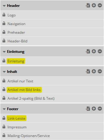
On the left side you can see the content elements of your mailing. You can edit, delete or insert each element multiple times. Which elements are available is determined by the programming of the selected template.


Using the example of demo template 1, we would like to describe three typical elements:

Introduction: You can provide this with a headline, text, a link and an image. Use introductory elements as a greeting and for short teaser texts that link to your company's news website, for example.

Articles with image on the left: There are usually several variations of articles. Typical are a headline, text and optionally an image, in this case with position on the left. However, articles can also be used to insert visual separators.

Link bar: Here you create well visible placed links, which e.g. lead to the imprint of your company website or a landing page.


When you open an element, there is no difference between previous and new editor when entering text etc., see section 'Editing content elements: The detail view'.

The same applies to the preview.

{/old} {new}

This help page describes the Newsletter Editor version 4.
Here you switch to the help of the editor V2 or check your currently used editor version.


In case of a template-based email, you assemble your mailing on the 'Content' tab by drag&drop.

Without a template selected, the 'HTML' and 'Text' tabs appear instead for manual input of HTML code and text part.

Thanks to the template, Shared Services - Graubünden Ferien automatically generates a multipart mail with HTML and text part that is compatible with all relevant email clients.

'Contents' tab

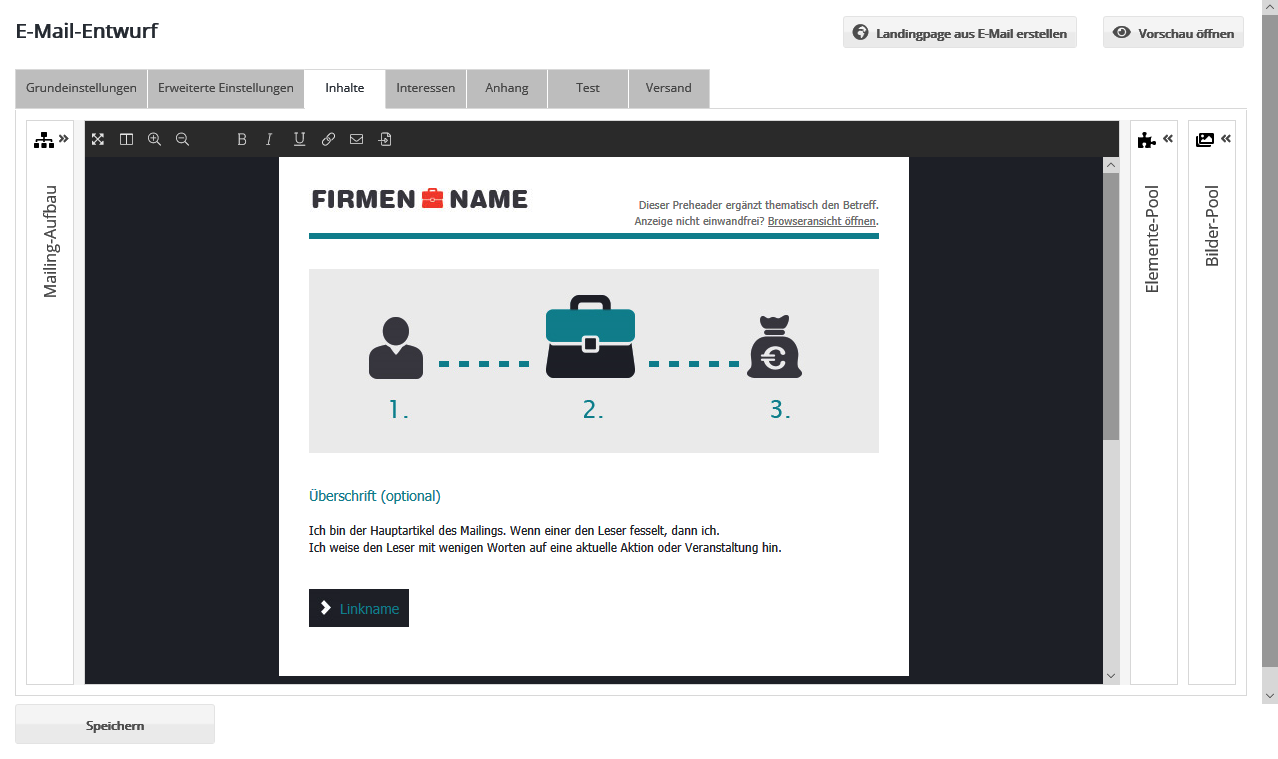
The screen consists of the top toolbar, the mailing design (center) and three side panels that can be expanded and collapsed: Mailing Structure, Elements Pool and Images Pool.

Inhalte


You edit texts directly in the mailing draft. The upper toolbar offers the following functions:

Werkzeugleiste  

Full Screen: Uses the entire screen for mailing editing. The full screen view can be closed using the Esc key or by clicking the button again.

Switch Editor Layout: For better clarity, the Mailing Layout menu can be placed to the right or left of the mailing design using this button.

Zoom In / Zoom Out: Changes the display size of the mailing draft, e.g. for a better overview when inserting or moving elements via drag & drop.

Font formatting B, I, and U: Select the desired text in the mailing draft and then click Bold, Italic, or Underlined, respectively.

Email Link: Inserts a placeholder for an email address link.

Website Link: Inserts a placeholder for a website link.

Input Helpers: Inserts a placeholder for an element created in ###system_name##. This can be used, for example, for subscriber data, a personalized salutation, or the link to a Shared Services - Graubünden Ferien internal landing page can be integrated into the mailing. It also provides additional formatting options.

To the right and left of the mailing design, 3 panels can be opened. You can choose to place the 'Mailing setup' panel on the left or right side of the screen, switchable via the 2nd icon at the top of the toolbar.

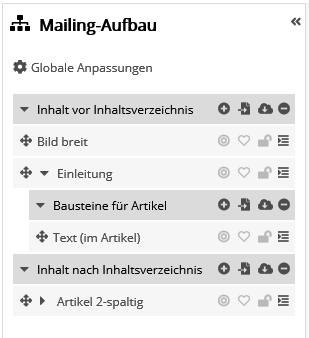
Mailing structure

Here the current structure of your mailing is displayed as an element tree. This view is especially helpful for working with more complex mailings. Containers (dark background color) are displayed at the top level of the element tree. These provide the basic structure of the mailing. The order of containers cannot be changed. Each container can contain elements (light background color) as well as further sub-containers. The elements are the visible parts of the mailing such as articles, images and texts. You can change the order of elements by dragging and dropping them according to your needs.

Which containers and elements are available in a mailing is determined by the selected mailing template.

To the left of the name of each container or element you will find the action buttons for that level. These allow you to perform certain actions within the directory tree:


Mailing-Aufbau

Verschieben

Move: Change the position of an element or its assignment to a container using drag and drop.

 
Aufklappen Expand / Collapse: This allows you to show or hide the child levels of a container or element in the element tree. The function is only for clarity in the element tree and has no effect on the mailing itself.  

The icons on the right in the header of each container provide the following functions:

 
Einfügen

Insert: Inserts a new element in the current container. You can add as many elements as you want, but you should not overload your newsletter.

 
Entfernen Remove: Removes elements of the current container. First wede you can remove the elements after confirming a security prompt  
Contents

Import content: You can insert one of your ready-made contents into the mailing. To do this, select one or more contents from the list that opens when you click on the Import content icon. Then assign a suitable article type and apply the content by clicking OK. Please note: If you select an article type that does not match the imported content, content components will be discarded. This applies to all content components for which no match could be found in the article. Example: The content contains an image on the left, but the article type contains only an image on the right. As a result, the image would not be included.


If the 'Contents' module is activated in your account, another icon appears behind the plus symbol. This allows you to insert a ready-made content that you want to use identically in several mailings or landing pages, e.g. your imprint. After selecting the desired content type, you select a text module, which is then transferred directly to the created content. Such a content module can be created in the menu 'Modules' --> 'Contents'.

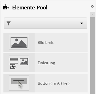
Elements pool

Elemente-Pool


You can use this pool to add new elements to your mailing. Drag and drop the desired element onto one of the areas marked in gray in the mailing design.

If no gray marked areas appear, this functionality is not yet integrated in the selected mailing template. In this case, please insert the elements as usual in the 'Mailing setup' panel.

Which elements are offered in the element pool and at which positions they can be inserted is determined by the selected mailing template.

Image pool

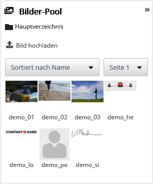
This pool shows all images of your Medienverwaltung. Initially, images from the main directory of your media management and its subfolders are displayed. However, you can also change the directory whose contents are to be displayed. You do this by clicking on the folder icon next to the directory name (in this case 'main directory').

Bilderpool


To insert an image into your mailing, drag and drop it onto one of the mailing's "image frames". You can also insert or replace images in the detail view of an element. To do this, open the detail view of the element. Now drag the desired image from the image pool either onto the input line of the image URL or onto the displayed preview image. The previously set image will be replaced by the selected image.

Some email templates allow the use of separate images for the desktop and mobile variants. In this case, please edit the images in the detailed view of the element.

Click the 'Upload image' button or drag and drop one or more image files from your Windows Explorer or Mac OS Finder into the image pool to include them there.

Edit content

To edit an element (item), you have two options:

  • Click on the name of the desired element in the element tree on the left.
  • Or: Move the mouse over the desired element in the design view. Then click on the title bar of the editing frame.


The icons for editing an element (item) are identical in the mailing design and element tree:

Verschieben Move the element to another position within the mailing.
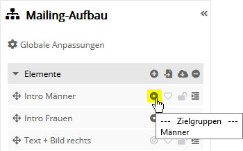
Zielgruppen

Target group articles: Display articles only for specific target groups. This way, each subscriber receives the articles that are relevant to them without you having to send out different mailings. A similar function for parts within an article provide Dynamische Inhalte.

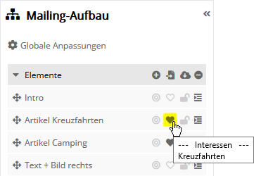
Interessen

Interest articles: Automatically sort articles by subscriber interest. This way, each subscriber gets their personal article order without you having to send out different mailings.

Sperren

Lock / Unlock: by clicking this icon you lock the item for modification by other users who lack the 'Allow editing of locked items' permission.

Bearbeitung

Editing menu: After expanding the menu, you will find the following functions:

  • Edit element: This opens the detail view for editing the content. We have explained the options for inserting text, images and links in the next section Editing Content Elements: The Detail View explained.
  • Copy element: Clicking on this icon inserts an identical copy of the selected element directly below it.
  • Delete element: This icon can be used to remove the selected element (after confirmation prompt).

Edit content: Enter data

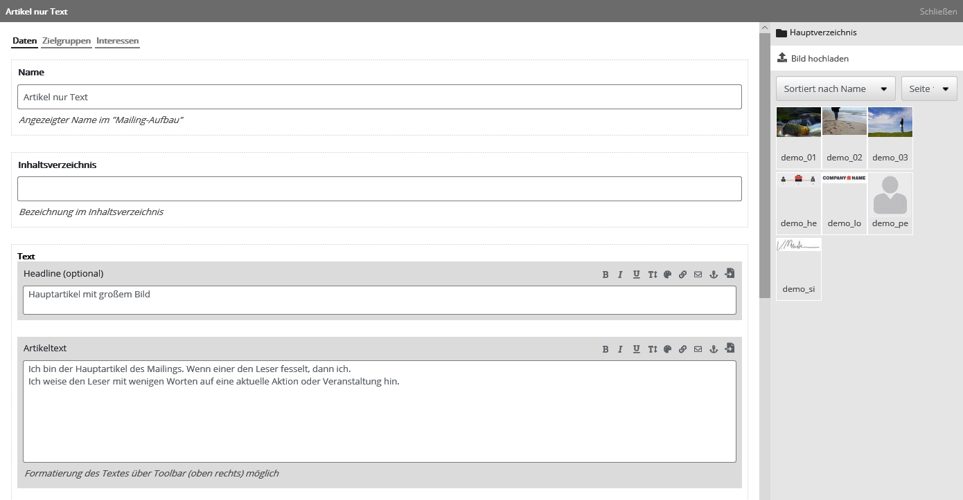
In the detail view of an element you insert your concrete content, i.e. texts, images and links. For small changes, you can also edit the texts and links directly in the mailing design interface. However, editing elements in the detail view is more convenient for larger adjustments and offers more setting options.

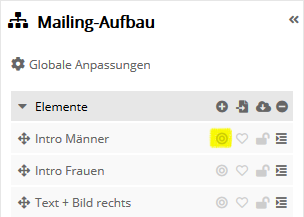
In the detail view, in addition to the 'General' tab, you will also find the 'Target groups' and 'Interests' tabs. You can access these from the mailing design interface by clicking on the target group item icon (circle) and the interest sorting icon.

Detailansicht

After clicking 'OK' the changes are displayed in the design view.

Embed text

You can enter texts in the input fields provided. Text breaks are automatically adopted.

Text einbinden

Various functions are available for formatting the texts. To do this, select the desired text fragment and choose between the formatting options described below. The corresponding format specifications are automatically transferred to the text by the system:

  • Font style
  • Font size
  • Font colors
  • Include web links
  • Include email links
  • Include anchor links

You can find more information about the individual functions below.

Front style

If you want to use different formatting, simply select the corresponding text passage and click on the corresponding icon B ('bold'), I ('italic') or U ('underlined').

Front size

Click the icon AA('Change font size') and select one of the offered font sizes from the list that opens.

Front color

Schriftfarbe  

You can select font colors by clicking the color palette icon.

The inserted color code can also be changed subsequently in the inserted placeholder. To do this, simply change the 6-digit number of the color code.

Include web links

Link Website


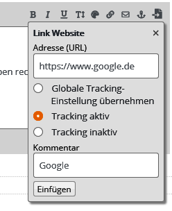
Select the text that you want to link. Then click the link icon and enter the URL, e.g. "http://www.example.com". Important: The link must always begin with http:// or https://, i.e. entering "www.example.com" is not sufficient.

To make the links evaluable for the statistics, link tracking must be activated. In the mailing tab 'Advanced settings' you can activate automatic link tracking for all links. If you want to enable link-tacking for specific links only, check the 'Enable tracking' box when inserting the link.

Optionally, enter a comment as an additional marker for your link. Different comments allow you to evaluate the clicks separately even if the same link URL is used multiple times, e.g. whether the recipient clicked on the link to the online store in the article text or in the navigation menu of the mail.

Include email links

Email links are not tracked. To avoid misconfigurations, email links are therefore created in an additional input mask. You can reach this via the letter icon.

Include anchor links

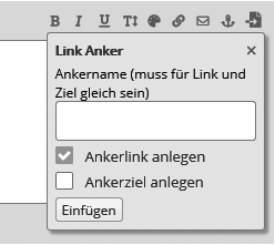
Ankerlink


Anchor links make it easier for the user to find related topics more quickly by specifically linking these topics within the mailing. To simplify the input of anchor links, the system provides a special input mask for generating text anchors. Use the anchor icon to open the corresponding input mask.

Enter the name of the anchor link or anchor target (the #jumpmark). Please note that the name of the anchor link and anchor target must be identical for the jump to work.


Edit content: Accessibility

Using the input helpers, you insert various placeholders in the text of a mailing, which are then replaced with the appropriate data during dispatch, depending on the subscriber. This makes it possible, for example, to integrate subscriber data, a personalized salutation, or the link to a Shared Services - Graubünden Ferien internal landing page into the mailing. It also provides additional formatting options. These can be easily integrated into your mailing by clicking on the 'Insert' icon.

Images

The Images tab is only available in the entry helper when you edit an image element of your email draft. In this tab you can insert an image from your Medienverwaltung. Alternatively, you can use the 'Upload' button to add a new image from one of your local directories to the media management.

Important note on image size: Depending on the template, you can specify in the 'Image width' and 'Image height' input fields the display size in which the image is to be shown in the mailing. In other templates, the image is automatically scaled to the size specified in the template. The actual file size of the image file used in the mailing remains unchanged. Therefore, make sure to scale down especially large image files (e.g. those with high resolution) to the planned display size. The appropriate functions for cropping and scaling down the image are available directly in the 'Medienverwaltung'.

Subscriber data

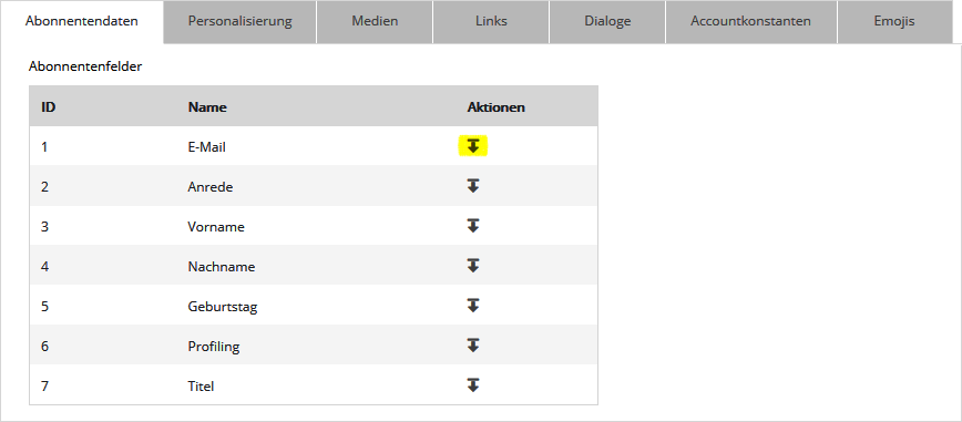
In order to be able to use personalized texts in your newsletter, it is possible to insert subscriber-related text components. For example, you can address the subscribers with their first or last name in the salutation. For this purpose, placeholders must be inserted for the required subscriber data. You can easily select these in the 'Subscriber data' tab in the input help.

Abonenntendaten

If you have booked the voucher module, you can also insert placeholders for a voucher series at this point. This way, each recipient receives his or her personal voucher.

Personalization

You can round off the personalization of your newsletter by, for example, adding a personalized form of address to the personal salutation. Example: instead of 'Dear Ms. ...', you can use the personalization feature to add the specific salutation 'Dear Ms. ...'. In the same way, you can create special content for specific target groups, e.g. for regular customers or frequent customers. To do this, use the 'Input Helpers' and select a 'Personalization Helper' in the 'Personalization' tab (rather for short text fragments such as the salutation) or an element of the 'Dynamic Content' type (for larger content, images and entire text sections). The contents of Personalization Helpers and Dynamic Content can also be created in ###system_name##. For details see 'Personalisierungshelfer' and 'Dynamische Inhalte' respectively.

Links

To be able to link to forms created in Shared Services - Graubünden Ferien within your mailing, it makes sense to use the 'entry helpers' for 'links'. These forms are administered in the 'Setups' section. In addition, in the upper part of the tab you can select different links with special functions or with special parameters (for link tracking).

Media

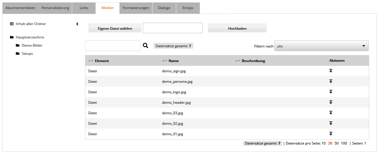
In addition to images, you can also integrate attachments in other file formats in your mailing. To do this, either upload the desired files in the 'Medienverwaltung', or use the designated area directly in the 'Accessibility' in the 'Media' tab. Click the 'Browse...' button or drag and drop a file from your Windows Explorer or Mac OS Finder onto the file name input field to select it. Then click the 'Upload' button.

Medien

To insert the uploaded files into your mailing, select them in the 'Media' tab of the 'Accessibility' dialog. To find the file you want to insert more quickly, use the directory tree in the left pane. This way you only have to search the folder for the uploaded file that actually contains it.

Formatting

Under Formatting you can choose between different formatting components. Insert them into your mailing text by clicking on the corresponding icon in the Actions column. Which formatting components are available for which elements of your mailing is determined by the selected mailing template. Only the most important ones are explained below:

Formatierungen

Edit front size / front color

You can set special text formatting for individual fragments of your article text. You can specify the different font styles and sizes in the detailed view of the article, as already mentioned, using the corresponding buttons. If these are not available in your current view, the input help 'Formatting' can alternatively be used for this purpose. To do this, position the cursor at the point where a differently formatted text is to be inserted. Open the 'Formatting' tab in the 'Input Help' and select the 'Font Size' or 'Font Color' command. Change the specified color value or size to the desired value. Please note that only the specified number will be replaced. The specifications px and # must not be removed. Finally, you can replace the placeholder '...' with the desired text.

Include lists

If you want to divide a text into list items, proceed as follows:

Select the entire text that is to be defined as a list with the mouse. Open the 'Formatting' tab in the 'Input Help'. First select the command 'unordered list' (list with markings) or 'ordered list' (numbered list). Then you have to assign the individual list items. To do this, select each list point individually with the mouse and choose the formatting 'List point' from the 'Input help' menu in the 'Formatting' tab. After that your list should look something like this:

[UL]
[LI]List point 1[/LI]
[LI]List point 2[/LI]
[LI]List point 3[/LI]
[/UL]

[UL]  denotes the beginning of the entire list and [/UL] the end. [LI] is the start of a single list item and [/LI] whose end.

Dialogs

Using the 'entry helpers' for 'dialogs', fixed placeholders for special dialog email functions can be inserted.

Account constants

In the 'Accountkonstanten' area you can define placeholders yourself. These can be used for standard email addresses or normally constant links (e.g. imprint), as well as for other account-wide constant values. To insert such placeholders, select them in the 'Accessibility' under 'Account constants'.

Dynamically show / hide target group articles


Mit aktivierten Zielgruppen-Artikeln:


Click the target icon to display the article only for specific audiences of your recipients. Then select the desired target groups.

Please check the result in the personalized preview. The article should only be displayed if the selected preview personalization belongs to one of the article target groups.

By the way, a similar function for parts within an article is provided by Dynamische Inhalte.


Sort interest artiles automatically


Mit aktivierten Interessen-Artikeln:


Click the heart icon to enable interest-based article ordering.

Under 'Order of articles', select the option 'Dynamic, biggest interest first'. Now mark the interests that match the article.

The more points the subscriber has collected for an interest, the higher up in the newsletter the article will be sorted. Since only interest articles swap positions with each other, at least two interest articles must be activated in the newsletter. Articles without assigned interest keep their position (default setting 'Static, fixed position').

You should check the result in the personalized preview afterwards. Depending on the interests of the selected preview personalization, the displayed interest articles should swap their position.


Preview your mailing

Vorschau

A click on 'Open preview' (top right) opens the personalized preview of your mailing.

{/new}

Tags: